“Heading Home” a sunset with foreground elements—visual balance and technique.

Onboard the Schooner Olad returning to Camden harbor.

Many photographers, new, amateurs, and some professionals, shoot sunrises and sunsets—nature at its most beautiful if you are facing east or west at the right hour. That includes me! Sun-up and sundown photos proliferate the social media. Why not? The photographer is sharing a special moment that he or she witnessed. It’s a grand feeling.

The reason I’m showing this photo is because it IS a sundown, but, there’s something going on in the foreground. I believe that is important, although not always necessary. Why? It adds to the storyline. It helps put the photo into a context.

To increase the contextual impact of a photo with the sun setting or rising, consider including a telling foreground. In this case, it is the bow of the schooner Olad, a 50-foot vessel out of Camden, ME.

I shot photos for an hour as the sun descended and infused the sky with beautiful colors. I tried from various parts of the vessel, all with the idea of capturing some aspect of the vessel in the foreground. This was it. When I clicked the shutter, my senses resonated as they often do when I get a good shot.

I believe this shot works because of the triangular balance of shapes in the left and middle. The two sails you see are headsails, one free flying, the other on a self-tending boom. Coupled with the boom, the three forms are triangular, which also repeats the theme of three, there being three forms (similar to a pin-wheel).

Without the bow and sails, this would be a nice sunset photo. If it existed, I’d probably crop half the water so the horizon was even lower. But having the three elements, proportionally balanced in the foreground, takes this mage up a few notches in terms of interest and engagement.

_______________________

Technical variables: There are at least two variables that challenge a photographer to attain well-exposed and sharp sunrise or sunset photos with foreground elements—low light conditions and distance between subjects (foreground to infinity). The sky usually requires a different exposure than the foreground unless you are happy with foreground silhouettes, which often work great. If you want everything in focus, you’ll need a small aperture to span the distance from near to far, thus allowing the greatest depth-of-field. Now you either have to use a tripod for a longer exposure or increase the ISO substantially. Increasing the ISO on some cameras creates visual noise in the image unless you have a camera with a relatively large sensor.

Technical details: This shot was taken using a Nikon D7100 at 1/25 sec and ƒ 1/16. ISO was set to 640. Focal length on my Nikon 24-120mm lens was set to 24mm which translated to 36mm being on a camera with an APS-C sensor (1.5x crop factor). Despite my care in balancing the settings, I still needed Adobe Lightroom to open up the shadows on the foredeck and sails and reduce some highlights in the sky.


Strength, light, and balance—about a Jeff Urquhart photo

Urquhart-bridge

What are we looking at?

It may take a moment to figure that its the underside of a bridge, in this case, the Robert Moses Bridge on the south shore of Long Island, near Captree Island. It was shot by a photographer friend, Jeff Urquhart.

What strikes me first about this image is the abstract symmetry. I’m intrigued by the repetition of overhead arches leading to the foggy “light” down the center. Three colors—granite,  blue-green, and red-orange, interplay well with the overall form and design.

This photo is well composed and exposed. It has a medieval and cathedral-like appeal that shows strength, light, and balance, all of which happen to be desirable human attributes.

Thanks for letting me share this captivating image, Jeff.

The Angel in the Witch — the healing power of a photograph

by John Todaro
“Witch-Hobble” by John Todaro

This photo is an oxymoron. A “good witch,” or as the title says, “the angel in the witch.”

Long ago people claimed the witch-hobble growing around one’s home would protect them from witches because they could not walk through it. Anyone who tried to walk through a witch-hobble thicket, would thenceforth be endowed with powers of a witch. (According to Ellen Rathbone, an environmentalist and naturalist.)

My focus, however, is on photographer, John Todaro’s brilliant composition of two witch-hobble leaves and what their power has done for me. I’ve been in a creative doldrum for several months because of personal reasons. Upon seeing this photograph, I was creatively lifted to a place where I could again appreciate pristine aesthetics.

Initially, I saw refined design in this composition—a balance of tonality, rhythm, repetition, variation of form, and simplicity. I especially like the apex on the left leaf duplicated in reverse by the convergence of the two leaves above their overlap.

The dual vertical light spheres directly above the leaves’ convergence, coupled with the overlap (or “lens” shape) atop a triangle represents to me, a beautiful totem composition.

But what did I see beyond the pleasing composition?

I saw an angel with a halo, spreading her wings. That’s probably what I needed to see and feel, for afterward, I felt rejuvenated and got right back to attending my creative spirit. My doldrums have dissolved, thanks to a conscientious, well crafted black-and-white photograph by my friend and fellow photographer, John Todaro.

“Visitor in Red” —a photo as enduring as a tugboat

Visitor in Red

When I photograph, I work a shot from many angles until I get a “sensation” that when I press the shutter release, I captured the spirit of the scene that originally caught my attention. I don’t analyze each composition as I frame a shot. It’s more intuitive. It’s more by “feel.” And if I choose to print an image, it’s rare that I know an image has staying power. So when I first printed “Visitor in Red,” I made it a limited edition of 8o, in addition to a few artist’s proofs.

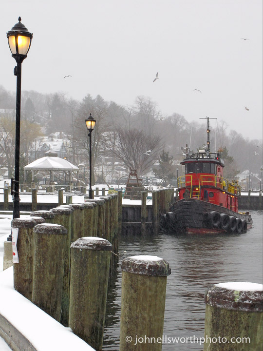
This scene was shot the day before St. Patrick’s Day (2007) in Northport, NY. I was walking my dog in the park about mid-day as it started to snow. I heard and felt a subtle rumbling. I turned my eyes to the harbor. This red tugboat was making its way toward the docks. I put my dog in the car, got my camera, and photographed the tug for about 40 minutes as it maneuvered to tie up and settle in. I got all angles, but this is the one I chose to produce.

After seven years, the photo still sells. Like a tug, the image has pulling power. I’ve heard from viewers they had a red tugboat as a child. Or their grandfather worked on tugs. Or they love Northport and this is a scene they’ve never witnessed. And so forth.

In my constant search to understand why an image resonates with some of us, I’d like to explore the composition and give a shot at interpreting it.

Composition

Color. With the exception of the red tug, the color palette of this photo is subdued green, brown, and yellow. This lends for a dramatic contrast imparted by the tug.

Leading lines. Implied lines are those created by visually connecting like elements as if one were “connecting the dots,” or stars in a constellation. I see three series of lines in the photo. One set, the pilings, directs your eyes to alongside the tug. The lit lanterns, from left to right, take you directly to the tug. All this under the four seagulls, which if “connected,” cups the scene, as if a visual canopy.

Balance. Although the tug is off to the right, it is visually balanced by the receding line of the lanterns’ yellow glow. I don’t think I’d get the same sense of equilibrium had the lanterns been off.

Interpretation

It’s probably what a tugboat represents that contributes to the appeal of this photo. There’s authenticity in the design of a tug. They are designed and built for utility. Function trumps fashion, trend, or vogue, to the point where “utilitarian” becomes an attractive look itself (as long as it’s for real).

A tug is designed to pull and push large barges and ships in all kinds of weather. Its purpose requires dedication, reliability, strength, persistence, and a courageous crew—all traits we respect and perhaps identify with.

A simple portrait of a moored tugboat may evoke similar interpretations. But I think such a portrait needs to be in an interesting composition, or visual milieu, to render an image as enduring as the tug itself.

“The Green Pram” —a photo by Jennifer Lau

jennifer-lau-green-pram

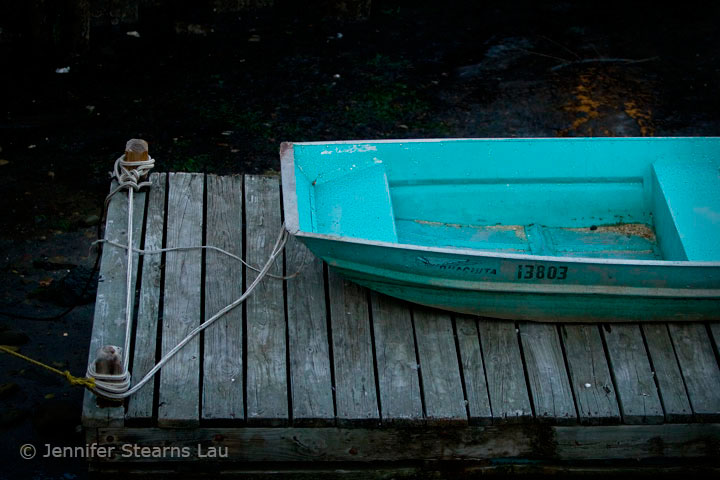
My fellow Firefly artist-photographer, Jennifer Lau, is currently exhibiting her work at The Wine Cellar on Main in Northport, NY (70 Main Street). Among her photos is a series of small boat images, one of which caught my eye. This green pram is striking because of is simplicity, form, and color.

First, the simplicity—one boat, one dock. The background is dark which eliminates visual clutter. We don’t see the whole boat. No need to. It makes its presence known without monopolizing the composition. Cropped so, it balances with the dock in terms of visual proportions.

In terms of form—The shapes and lines are very pleasing, harmonic in a way. There are two primary vertical lines and one horizontal line, all three of which visually stabilize this photo. The rope on the left, strung taught between the two dock bollards like a guitar string, and the bow of the pram are vertically parallel. The horizontal lower edge of the dock “grounds” the image. The rhythm and repetition of the parallel dock planks contribute to the overall harmony.

Use of color—Other than the green pram, this image is primarily monochromatic. Coupled with the simplicity of the composition and harmonic play of lines, the color adds balance, interest, and pull.

To see more of Jennifer’s work, visit The Firefly Artists gallery at 180 Main Street or, until  January 6, 2015, The Wine Cellar on Main.


Thursday Night Lights—a painting compared to photography

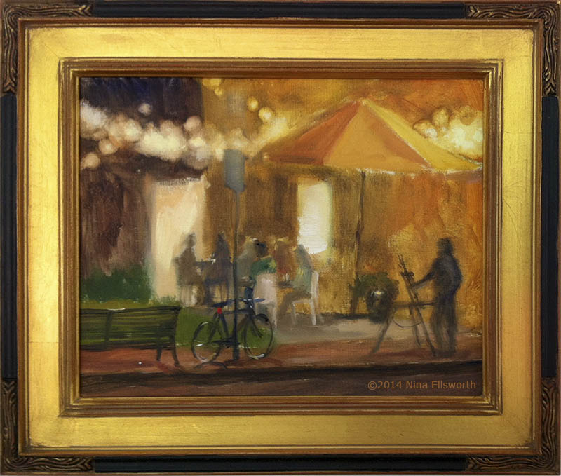
Nocturne—First Place at the Maryland Federation of Art, June 2014.

This oil painting, by Nina Ellsworth, grabbed my attention because of an idea I’ve been thinking about regarding interpretive work. Much of the photography I’ve been doing over the years has been literal. Recently, I’ve started exploring more impressionistic pieces, sometimes bordering on abstract. Abstracts do evoke feelings because of color, form, and intrigue as where the image came from. My sense, however, is that I’d prefer to give a hint of what the image is, or in what context the photo was shot.

For me, Nina achieved that with this painting. The majority of this rendering is impressionistic, blurry, “out-of-focus,” except the bicycle. It is the sharpest element in the painting and anchors me to a reality. Photographers do the same thing. When one or two elements, ever-so-small, are in sharp focus, while the rest is soft, out-of-focus, an image is rendered as somewhat impressionistic, or interpretive. This can be achieved with large apertures that lend shallow depth-of-fields coupled with selective focusing. Or it could be the use of shooting through rainy windows, photographing reflections, or using long shutter speeds so moving elements become blurry. Of course, some of this can be achieved via post-processing in photo-editing tools.

In Nina’ s painting, she’s got what photographers call bokeh, blurry background, scenes beyond the lens’s depth-of-field. I really like that—look at the string of lights across the top! And look at the shadowy silhouette of a plein-air painter.  In photographer’s terms, this painting has very shallow depth-of-field. The bicycle is the sharpest. Everything beyond it is impressionistic in varying degrees.

And as a complement, the warmth of the painting generated by the incandescent lights is enhanced by the golden frame—a beautiful piece.

No wonder it sold!