
When I photograph, I work a shot from many angles until I get a “sensation” that when I press the shutter release, I captured the spirit of the scene that originally caught my attention. I don’t analyze each composition as I frame a shot. It’s more intuitive. It’s more by “feel.” And if I choose to print an image, it’s rare that I know an image has staying power. So when I first printed “Visitor in Red,” I made it a limited edition of 8o, in addition to a few artist’s proofs.
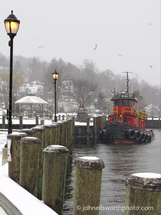
This scene was shot the day before St. Patrick’s Day (2007) in Northport, NY. I was walking my dog in the park about mid-day as it started to snow. I heard and felt a subtle rumbling. I turned my eyes to the harbor. This red tugboat was making its way toward the docks. I put my dog in the car, got my camera, and photographed the tug for about 40 minutes as it maneuvered to tie up and settle in. I got all angles, but this is the one I chose to produce.
After seven years, the photo still sells. Like a tug, the image has pulling power. I’ve heard from viewers they had a red tugboat as a child. Or their grandfather worked on tugs. Or they love Northport and this is a scene they’ve never witnessed. And so forth.
In my constant search to understand why an image resonates with some of us, I’d like to explore the composition and give a shot at interpreting it.
Composition
Color. With the exception of the red tug, the color palette of this photo is subdued green, brown, and yellow. This lends for a dramatic contrast imparted by the tug.
Leading lines. Implied lines are those created by visually connecting like elements as if one were “connecting the dots,” or stars in a constellation. I see three series of lines in the photo. One set, the pilings, directs your eyes to alongside the tug. The lit lanterns, from left to right, take you directly to the tug. All this under the four seagulls, which if “connected,” cups the scene, as if a visual canopy.
Balance. Although the tug is off to the right, it is visually balanced by the receding line of the lanterns’ yellow glow. I don’t think I’d get the same sense of equilibrium had the lanterns been off.
Interpretation
It’s probably what a tugboat represents that contributes to the appeal of this photo. There’s authenticity in the design of a tug. They are designed and built for utility. Function trumps fashion, trend, or vogue, to the point where “utilitarian” becomes an attractive look itself (as long as it’s for real).
A tug is designed to pull and push large barges and ships in all kinds of weather. Its purpose requires dedication, reliability, strength, persistence, and a courageous crew—all traits we respect and perhaps identify with.
A simple portrait of a moored tugboat may evoke similar interpretations. But I think such a portrait needs to be in an interesting composition, or visual milieu, to render an image as enduring as the tug itself.
It’s interesting that you take photos by intuition rather than looking for specific composition formulas, because I can see all the compositional points you mentioned there–leading lines, color, etc.–along with a few others. It makes one wonder if these principles are somehow hardwired in our brains if they show up in abundance when taking a photo that just ‘feels right.’
I think after studying composition, visual arrangement becomes reflexive, which appears to be intuitive. We can be taught composition, and if applied, we can become better photographers and painters.
I do recognize when “working” a shot, I am looking for a visually pleasant arrangement. After years of doing this and studying aesthetics, I have an idea of where to position myself to achieve an interesting and balanced point of view. I also believe I now couple “feel” with pre-visualization, consciously applying principles of composition to my shots.
Thanks, Nina. This is an area I enjoy exploring.
This one of my favorites, John, and I see it everyday on the wall above my breakfast table, where I intuitively appreciate its appeal without asking why. Perhaps that appeal is in the hospitable invitation to “come aboard”, because of the perspective that leads one to the tug. The warmth of the red color is a strong contrast against the cold of the grays and of the snow. In the times I’ve walked on this windy dock in the winter, at the end, my thoughts always turn to finding shelter. Perhaps the tug?
Thanks so much for your appreciation and perspective of one of my favorites as well, John.