The Angel in the Witch — the healing power of a photograph

by John Todaro
“Witch-Hobble” by John Todaro

This photo is an oxymoron. A “good witch,” or as the title says, “the angel in the witch.”

Long ago people claimed the witch-hobble growing around one’s home would protect them from witches because they could not walk through it. Anyone who tried to walk through a witch-hobble thicket, would thenceforth be endowed with powers of a witch. (According to Ellen Rathbone, an environmentalist and naturalist.)

My focus, however, is on photographer, John Todaro’s brilliant composition of two witch-hobble leaves and what their power has done for me. I’ve been in a creative doldrum for several months because of personal reasons. Upon seeing this photograph, I was creatively lifted to a place where I could again appreciate pristine aesthetics.

Initially, I saw refined design in this composition—a balance of tonality, rhythm, repetition, variation of form, and simplicity. I especially like the apex on the left leaf duplicated in reverse by the convergence of the two leaves above their overlap.

The dual vertical light spheres directly above the leaves’ convergence, coupled with the overlap (or “lens” shape) atop a triangle represents to me, a beautiful totem composition.

But what did I see beyond the pleasing composition?

I saw an angel with a halo, spreading her wings. That’s probably what I needed to see and feel, for afterward, I felt rejuvenated and got right back to attending my creative spirit. My doldrums have dissolved, thanks to a conscientious, well crafted black-and-white photograph by my friend and fellow photographer, John Todaro.

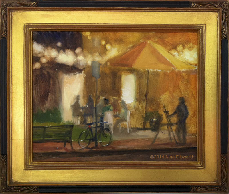
Thursday Night Lights—a painting compared to photography

Nocturne—First Place at the Maryland Federation of Art, June 2014.

This oil painting, by Nina Ellsworth, grabbed my attention because of an idea I’ve been thinking about regarding interpretive work. Much of the photography I’ve been doing over the years has been literal. Recently, I’ve started exploring more impressionistic pieces, sometimes bordering on abstract. Abstracts do evoke feelings because of color, form, and intrigue as where the image came from. My sense, however, is that I’d prefer to give a hint of what the image is, or in what context the photo was shot.

For me, Nina achieved that with this painting. The majority of this rendering is impressionistic, blurry, “out-of-focus,” except the bicycle. It is the sharpest element in the painting and anchors me to a reality. Photographers do the same thing. When one or two elements, ever-so-small, are in sharp focus, while the rest is soft, out-of-focus, an image is rendered as somewhat impressionistic, or interpretive. This can be achieved with large apertures that lend shallow depth-of-fields coupled with selective focusing. Or it could be the use of shooting through rainy windows, photographing reflections, or using long shutter speeds so moving elements become blurry. Of course, some of this can be achieved via post-processing in photo-editing tools.

In Nina’ s painting, she’s got what photographers call bokeh, blurry background, scenes beyond the lens’s depth-of-field. I really like that—look at the string of lights across the top! And look at the shadowy silhouette of a plein-air painter.  In photographer’s terms, this painting has very shallow depth-of-field. The bicycle is the sharpest. Everything beyond it is impressionistic in varying degrees.

And as a complement, the warmth of the painting generated by the incandescent lights is enhanced by the golden frame—a beautiful piece.

No wonder it sold!